Spotter
A landing page crafted for an Indiana based startup called Spotter.
Background
During my time in college, I helped create landing pages for several different groups, businesses, and people. One of the more interesting projects I worked on was the landing page for a fitness startup called Spotter.
Spotter provides a fitness tracking device that any person from the everyday bodybuilder to the novice can fully utilize.
Requirements
Since the team had earned the opportunity to present at TechCrunch in New York City, they needed a landing page to perform the following tasks:
- Show off their awesome product
- Provide an option to join their email list for updates
- Link their social media to provide live updates from the team
I also wanted to learn more about parallax scrolling in single page websites as well as using Waypoints in websites to trigger animations.
Implementation
The Spotter team came to me with a base template that they had found on ThemeForest. However, the theme had a lot of things that needed to be redone. This includes:
- Fixing hacky solutions created by the original template creator
- Redoing animations
- Implementing background video on landing page
- Using Twitter API to get recent tweets
Home Page
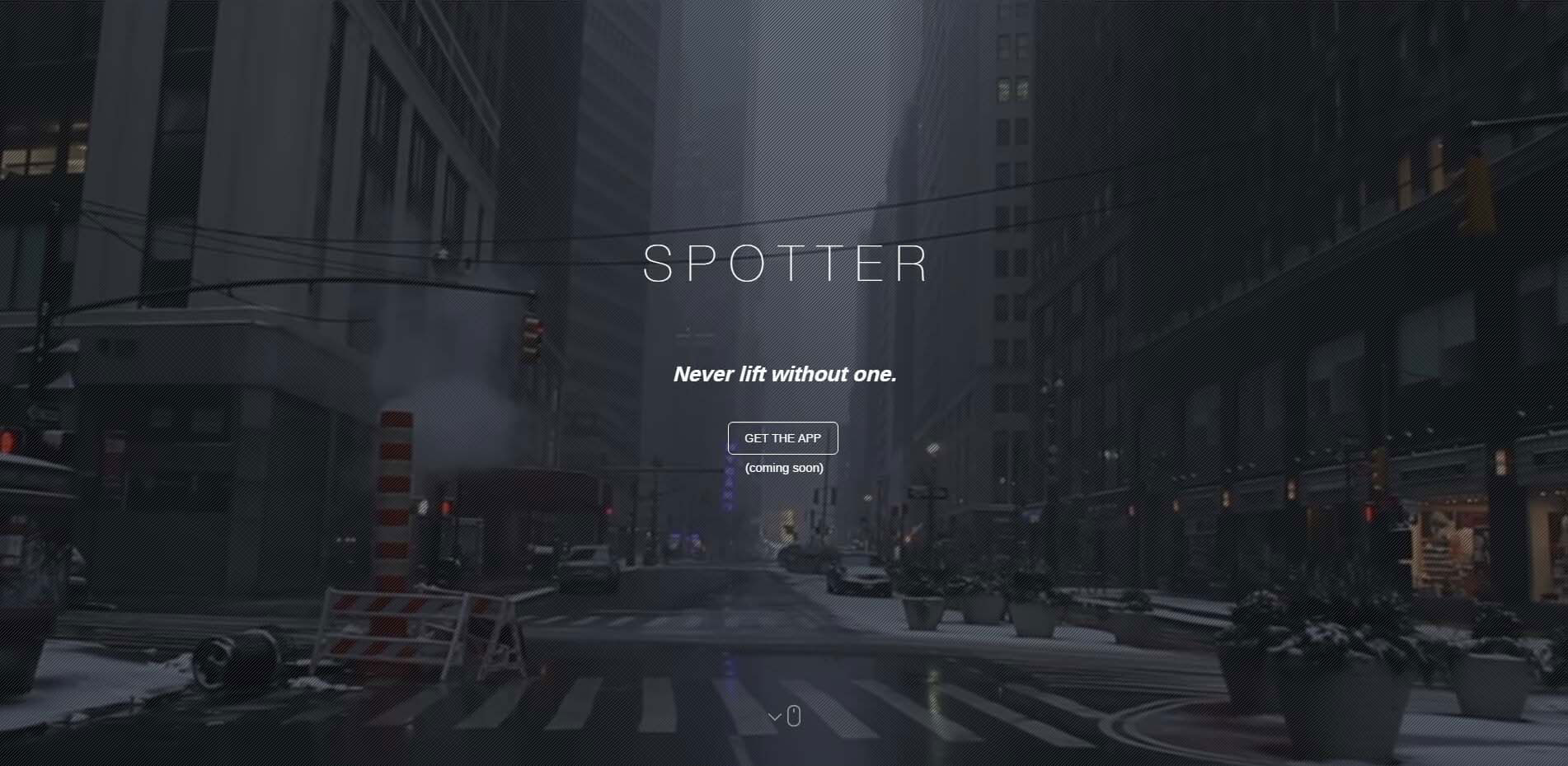
I wanted something that would look unique and would portray an urban vibe for the startup. I looked on YouTube to find appropriate videos to use and found this awesome stock video of New York City.
Since they were presenting in New York, I thought this would definitely portray an awesome vibe for Tech Crunch. I added the title of the company, as well as their slogan, and a call to action.
To offer some UX guidance, I added a little mouse icon with a bounce animation. This is a common technique to indicate to the user that they should continue to scroll down the page.
Features
This section was used to describe the capabilities the application offered. Using Waypoints, I triggered an animation to make the mock screenshots slide in from the left and right when the user hits the top of the Features section.
In order to make things look nicer, I also added hover animations over the four "bullet points".
The final result ended up looking very smooth, and impressed a lot of people:

Newsletter & Gallery
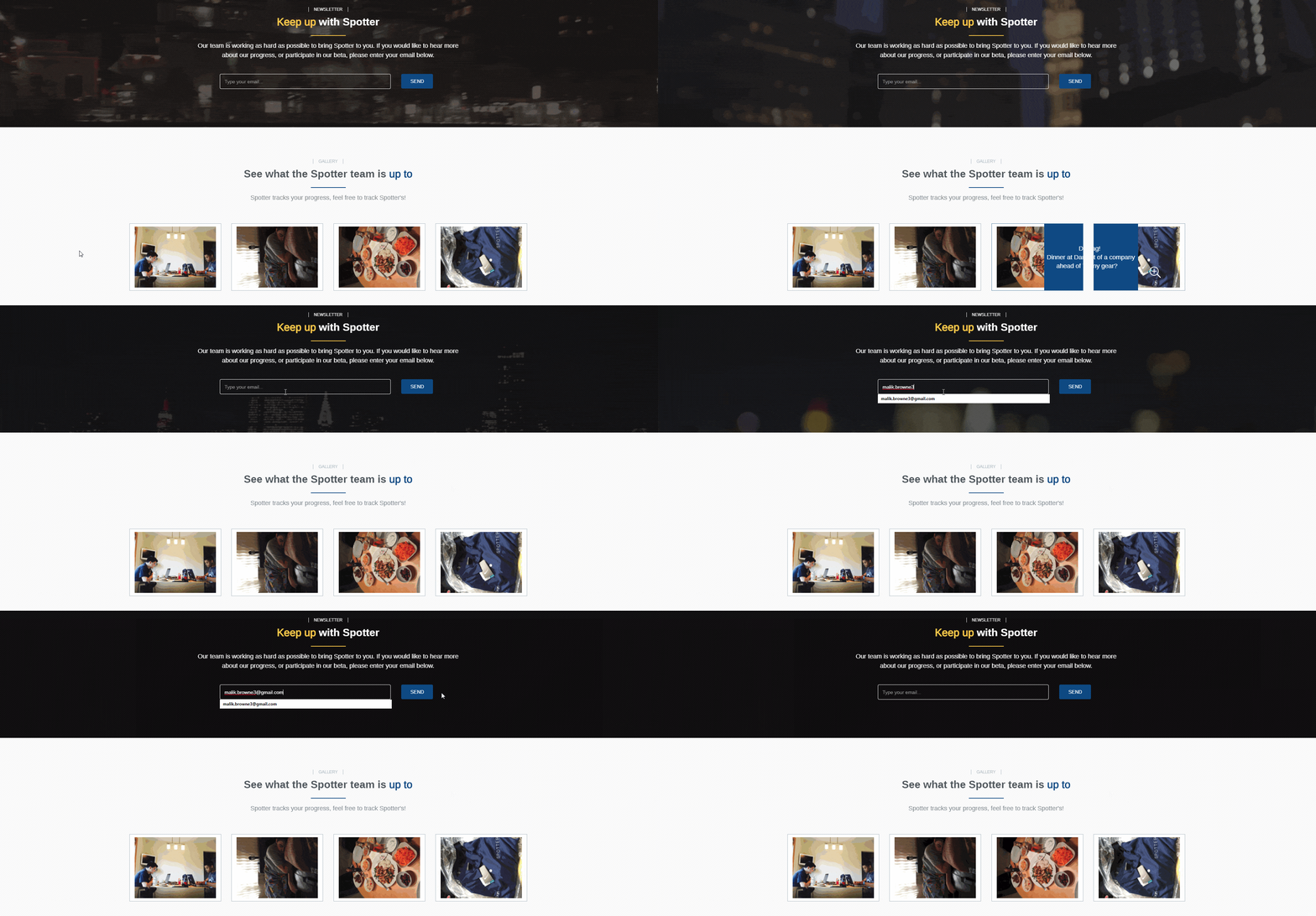
The newsletter was straightforward – it uses AJAX to submit the email address to a PHP file. The file will then validate the email, and then send it off to MailChimp.
For the gallery, I pulled the four most recent pictures from Spotter's Instagram. Once the photos were retrieved I created hover animations over each photo and added a lightbox in order to see a larger version of the image.
Using jQuery HoverDir, I was also able to get the hover animation to track which side of the image the user enters. This allows me to then and transition from that side. You can see the final result below:
Contact Form
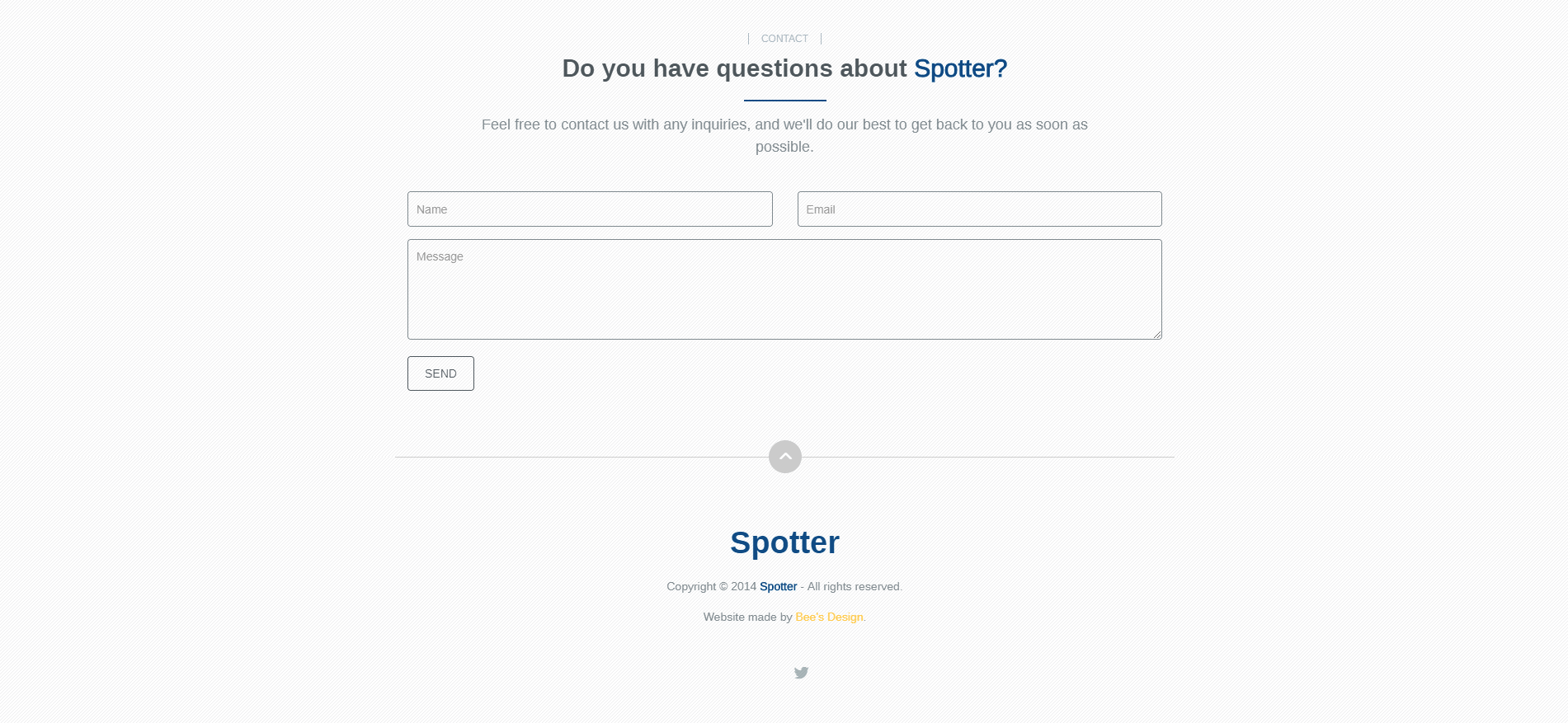
The final thing that needed to be done was to add a contact form. When the person hits the bottom of the page, the form animates in using waypoints. I added in a wobble animation as it transitioned in to get the user's attention.
Like I said before, the form is submitted via AJAX to a contact.php file. The file parses all the provided fields, and if valid will send it over to the Spotter team. The final result can be seen below:
Project Challenges
I spent a lot of time trying to make this website look perfect. The first part that I struggled with was creating the smooth animations on the Features page. Since there was a lot going on, I had to utilize the ":after" and ":before" properties on some of the elements.
The next part I had trouble with was the video background. Instead of only being in the top section, I wanted it to stay in the background, and swap between transparent and white sections as the user scrolls down the page. I ended up having to use a combination of CSS and JavaScript since the video is initially loaded via video plugin.
Some things that I learned from this project were:
- Parallax Scrolling
- Advanced CSS3 Animations
- AJAX submissions to prevent client-side refresh upon submitting
- Branding and setting color schemes for websites
- Basic UX Principles
Technologies Used
- HTML5/CSS3
- JavaScript
- jQuery
- PHP
