Post Grad Portfolio
A website used to display my completed projects during college.

Background
This project was the portfolio I used when I first started applying for jobs. I originally got inspiration from a popular UX designer's portfolio, Melanie DaVeid.
I thought it was really cool how she had the screen split up into two separate parts, and had one side scroll along with the content. I took that effect and made it my own for the portfolio.
Requirements
At this time, I had become really comfortable with Angular, and I wanted to learn how to create single page applications.
Two-way data binding blew my mind.
I knew I wanted my portfolio to have three things:
- Home Page
- About Page
- Projects Page
Using bold colors such as orange and green is not common, as they're not considered "friendly". In order to combat that, I used a more "muted" orange and green, so that the colors seemed more light.
In order to save time, I decided to use Bootstrap to take advantage of their mobile features.
I also wanted to make sure I tried to imitate the effect Melanie DaVeid used for the about section.
Implementation
Creating the Home & Projects Page
I wanted the home page to be very simple. I'm a big fan of minimalist design after all.
Using a simple typical effect script called typer.js, I was able to get a cool looking typing effect on the home page.
The final result for the home page looked very clean, and I was definitely happy with it:

The projects page was slightly different.
In order to follow along with the single page application flow, I needed it to change between projects in the same view.
I ended up using Angular's ngRoute to direct to different templates based on the project the user chose.
Each template followed the same guideline:
- Title
- Screenshot
- Live Site & Github
- Description
- Technologies
Once I had the controllers set up for each individual template, it was easy to pass in the data for each project.
Creating the About Page
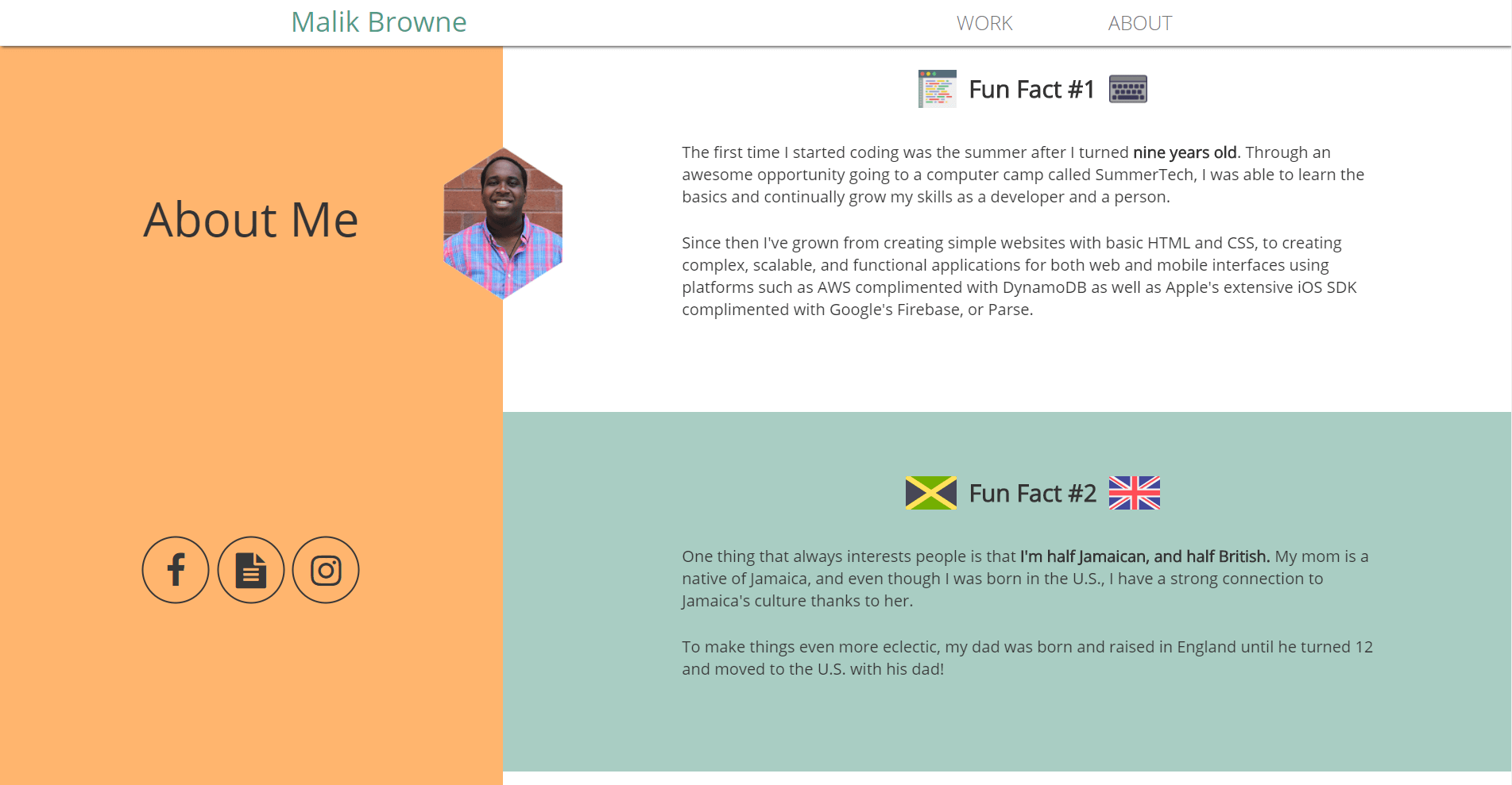
This page was simple - each section had a different "fun fact" about me. I wanted each section to fade in as the user scrolled near the section.
In order to do this, I used jQuery Waypoints.
The code to set that up is very simple:
1 2 3 4 5 6 7 8// app.js $('.funfact').css('opacity', 0) $('.animated').waypoint(function() { $(this).toggleClass($(this).data('animated')); $(this).css('opacity', 1) },{ offset: '100%', triggerOnce: true }); //...
The final result ends up looking really slick:

Another popular feature of single page applications is smooth scrolling from section to section when clicking links in the navigation bar.
This is pretty simple to do with jQuery and a little bit of Regex:
1 2 3 4 5 6 7 8 9 10 11 12 13 14 15 16$(function() { // This will select everything with the class smoothScroll // This should prevent problems with carousel, scrollspy, etc... $('.link').click(function() { if (location.pathname.replace(/^\//, '') == this.pathname.replace(/^\//, '') && location.hostname == this.hostname) { var target = $(this.hash); target = target.length ? target : $('[name=' + this.hash.slice(1) + ']'); if (target.length) { $('html,body').animate({ scrollTop: target.offset().top }, 1000); // The number here represents the speed of the scroll in milliseconds return false; } } }); });
Project Challenges
The hardest part of this project was imitating the scrolling effect that Melanie DaVeid did. I wasn't able to get it perfect, but I got it pretty close.
This project was an awesome precursor into Angular and it helped me learn how powerful JavaScript can be if used correctly.
Some things that I learned a lot about on this project were:
- Angular Templates and Directives
- Angular's ngRoute
- Building a basic single page application
- Layout and Color Theory
Technologies Used
- HTML5/CSS3
- AngularJS
- jQuery

